Katie Shugg's Art Website

|
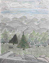
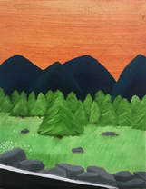
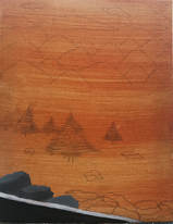
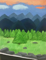
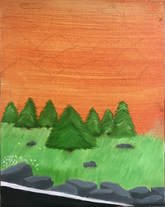
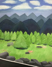
9/21/2017 0 Comments oil paintingsTexture Landscape Oil Painting Self Evaluation 1. Describe the craftsmanship of your painting. (Is it neat and well executed?) In my painting, I tried to do many layers and go into a lot of detail in order to make it look neat and executed. I put a lot of effort into the different shades of green in the trees. 2. Describe your choice of colors/color harmonies and how you used them throughout the artwork. I used many different shades of green throughout the grass and the trees. In the mountains, I used blues, greens, grays, and white & black. I tried to put a lot of value in the mountains. 3. How did you create contrast in your painting? I tried to make the objects that were closer appear more detailed and brighter, while for the objects that were further away, I used less details and less bright and intense colors. 4. How did you apply textures, highlights and shadows to enhance your artwork? I put shadows under the trees and I tried to put some highlights in the trees. In the grass & trees, I tried to make the texture appear somewhat soft. In the clouds, I made them look fluffy. In the rocks, I tried to make them look sharp. 5. How were you able to create depth in your painting? For the objects that were closer up, I used more detail and brighter colors. For the objects farther away, I used less detail and less bright/intense colors. For example, for the mountains, the ones closer had more intense colors in them, and the ones farther away had more grays and blues. 6. What painting techniques did you use that made your painting successful? I tried to use lots of texture and detail, and I tried to use cool colors throughout the entire painting, which I thought brought it all together. 7. Describe any difficulties you had creating your drawing and what you could do to improve your drawing? I had trouble with the trees and the grass because both of these things required lots of detail and effort put into it. I could improve it by creating more contrast between the trees and the grass. 8. Explain the successes you had with this painting. I think the texture of the trees came out really well. I also love how the rocks look next to the grass. The mountains turned out pretty good, I wish they looked more realistic though.
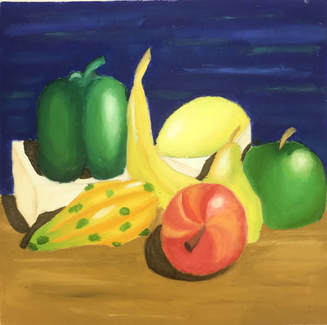 Still Life For the Still Life painting, I worked with oil paints. I used many different colors including yellow, red, orange, green, blue, etc. I tried to blend the colors together as well as I could, and I really tried to make this look realistic and 3D. I really struggled with the shadows and highlights. It is really hard to make the highlights look realistic on the fruits. I love how the pepper and the green apple came out. 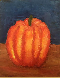 For this pallet knife painting, I used different shades of orange, yellow, red, brown, white, and green. This was the first time I've ever painted with oil, and used a pallet knife to paint, so it was a very interesting experience, but I liked it a lot. I wish I had more put more time and detail into the background, but other than that, I like it.
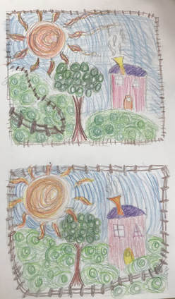
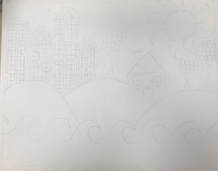
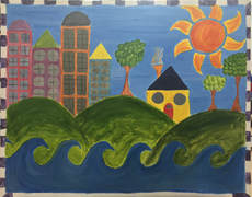
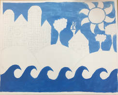
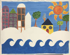
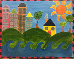
To the left is an image of both of my Hundertwasser project composition sketches. I tried to make the border the fence in both of these sketches. I also made the Sun the focal point of the sketches.
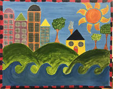
“Hunderwasser” Self Evaluation critique
1) My painting is very neat and for the most part it is well executed. I tried to blend the different greens and blues in the sky and hills as best as I could, but for the most part I think it is neat. 2) My painting has many bright colors and patterns, I think these are 2 of the main ideas Hunderwasser used in his paintings. Although I do wish I had used more patterns and made it look a little more unique. Describe your choice of colors/color harmonies and how you used them throughout the artwork. 3) The focal point of my art work I'd say is the sun. It stands out the most, it is what draws your attention when you first look at the painting I feel like. I wish I had made it pop out more though. 4) I tried to use texture in the trees and in the hills. I made the trees look fluffy and the hills look smooth. I used lots of curvy/round patterns such as the curvy hills, waves, and sun. 5) I put a border that was bright and colorful and popped out a lot, I used red and purple colors. I think it enhances the art work because it kind of stands out and adds something a little different to the art work. 6) Some difficulties I had were getting the hills to look smooth and round. I also had trouble blending the different shades of green in the hills. I wish I had made the painting a little more unique and I wish the sun popped out more.
0 Comments
Leave a Reply. |
AuthorKatie Shugg, Class of 2020 in Ms. Purtee's Art 1 Class Archives
January 2018
Categories |
 RSS Feed
